The Power of Color
How Your Store Can Harness the Influence of Hues

By Andrea Hein
Color is one of the most powerful tools in a retailer’s tool kit. It has the power to turn us off or pique our interest. It grabs our attention and draws out our emotions – and has the power to invoke memories instantly.
Using color correctly in the retail world is extremely important. “Color is the key to success in the design industries,” says Marcie Cooperman in Color: How to Use It. “Color is what drives customers to your door. But the wrong color can keep customers from buying your product.” If you take nothing else from this article, take that sentence and remember it.
Colors Define Brands
As business owners, managers or merchandisers, our focus is always on the customer – what do they want, what do they need and what could make their shopping experience easier? We pigeonhole them and try to figure out who they are and what target market they fit into, but when it comes to color, we need to simplify things.
Color evokes emotion in us unlike anything else and we create emotional attachments to color. When a brand features one of the colors in their line or their displays we easily form attachments to those products. Think about Kate Spade’s pink and green purses or Dior’s black and white offerings.
Colors of Products Beyond Our Control
It’s important to remember that product colors and fashion lines are not determined by shop owners and merchandisers. By the time these items get to us they’ve been selected up to two years prior. Yet, shop owners and buyers still can select within those lines to create a powerful color story which communicates their brand to customers.
Your Store’s Brand Colors
Your brand starts with your logo where you have all the control. Your logo should communicate to customers what they can expect in your store. Then you move onto your shop’s brand colors.
“Color is the marketing tool that sends a message to customers instinctively without engaging their conscious attention,” says Cooperman in Color: How to Use It. “The message of color is actually understood faster than words”.
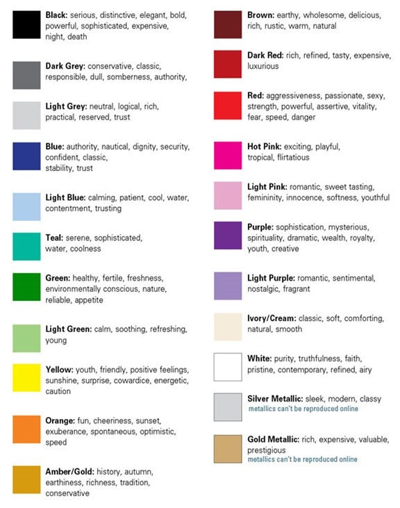
Consider what the colors you’re using are communicating to customers utilizing this chart from Xtreme Brand Makeover (www.xtremebrandmakeover.com). As you run down the list of colors and their associated emotions you can start to make connections with familiar brands. The black and red of Lululemon’s logo communicates strength, elegance and passion. Sportwear companies typically choose bold, vibrant colors because we understand subliminally that those colors mean health, vibrancy, youthfulness and energy. As you can see, color can and will do most of the marketing for your store. Once you’ve presented your brand to your customer and piqued their interest through your exterior presentation, the interior of your store must hold the same power that your logo does. Your walls and your packaging must be consistent with the colors in your logo and the message you’re conveying because color will set the mood for your customers the second they step through your door.
The color you choose inside your store should say just as much about the products you offer and your brand as your logo does. You want to create a welcoming environment that expresses who you are and what your shop is all about.
Andrea Hein is the owner of Andrea Hein Occasions which specializes in custom décor for various clients including the Buffalo Bills. Hein started her career at Walt Disney World and has worked for both boutique and big-box stores. (www.andreaheinoccasions.com)